Showing the impact of a key player in the energy transition
CPCU supplies more than a million Parisians with heat through the largest urban network in France. The company wanted to modernise its image. The objective: to highlight its role in a more responsible, more breathable and more comfortable city.
Showing and explaining
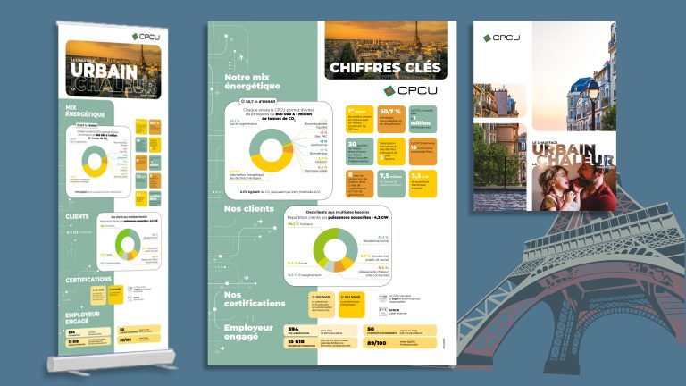
We were asked to design a new visual identity through a series of materials: corporate brochure, key figures leaflet, roller banners, posters, PowerPoint… All designed to speak to employees and external partners alike.
Tailor-made editorial and visual creation
Two creative routes were proposed around the same foundation: shared comfort and environmental commitment.
We rethought the colour palette to warm up the brand world, reworked the typography for greater elegance and reduced the space given to technical content in favour of more human visuals. All in modern formats, suited to reading and to use in the field.
A winning response
Our approach won the tender. It met the central challenge of the project: humanising the message while structuring the information. The materials are now coherent, harmonised and easy to adapt. They convey a clear image of CPCU's ambition: to provide useful, local, sustainable heat.